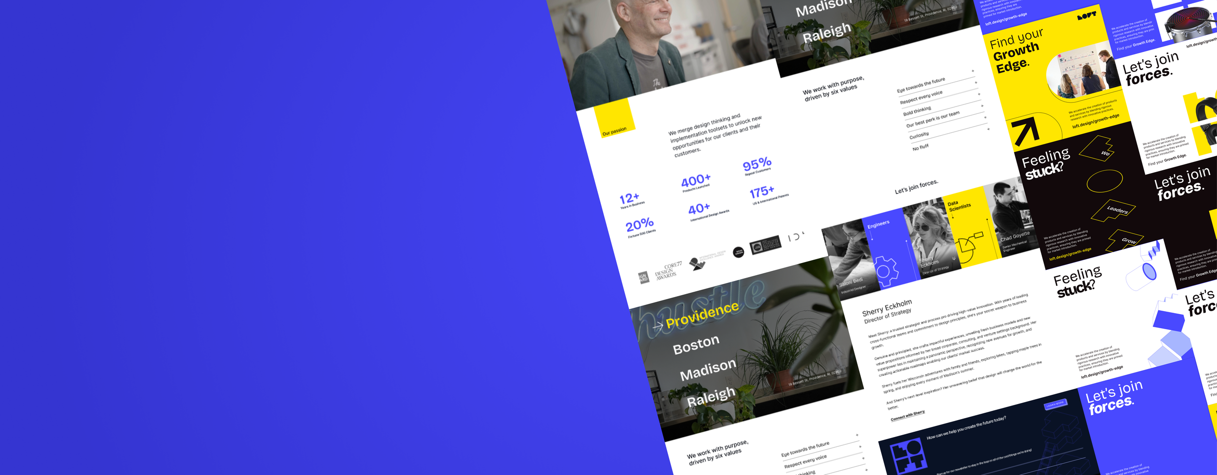
Loft Site Refresh
Summer and Fall 2024 Design Internship
TIMEFRAME
Jun - Nov 2024
ROLE
UI UX designer
TOOLS
Figma, Illustrator, Premiere Pro
DISCIPLINES
Product Design, Branding
Overview
How might we increase the Loft website SEO by revamping the About Us and Expertise webpages through a brand refresh?
Project Brief
25% of people who land on Loft’s website navigate to the "About Us" page while 10% navigate to the “Expertise” page, proving that both need to be treated like landing pages. As a design intern at Loft Design, I had a hand in increasing site analytics by modernizing their current design system and website, working closely with senior designers, developers, and the founder, auditing their current website and improving usability across 5 webpages. Bi-weekly deliverables were handed off to our team’s developer, allowing me to prioritize client projects.
Core Team
Felix Leitner-Mittersinker (Dev)
Dan Grove (Design/Dev)
Jon Riehle (Supervisor)
Clotilde Grimault (Project Manager/Data Analyst)
Saloni Bedi (Collaborator)
Gregor Mittersinker (Founder)
Impact
Between August and September 2024, the number of page views on the “Expertise” page grew by 49%. The number of page views on the “About Us” page was equivalent to the overall trend (in page and overall views).
Overall, there was no huge change in traffic before and after the transition. The takeaway is that these numbers are highly volatile and analytics performance depends on much more than just the visual design alone. It’s important that every company’s website is consistently updated & refreshed to reflect the innovation mindset of a design agency.
Analytics is just one part of a larger whole.
Key Challenges
It’s hard to keep track of and update team portraits for Loft’s in-person and remote employees. Not everyone can participate in one photoshoot, and the team occasionally shifts.
Photos and text patterns are inconsistent across different pages; text, gradient, and image are clashing in the same frame.
The heavy use of gradients, opacity levels, and Loft’s signature shades of “Electric Purple” (#4949FF) has diminished their visual impact.
Internal and Competitor Analysis
I conducted an analysis of Loft Design’s current “Our Team” and “Expertise” pages to find target features the team wants to prioritize. From there, I researched 50+ design agency websites and pitched the top ones to Gregor (founder) and the Loft team. Research helped me determine page layouts, photo styles, and interactive elements are the most effective to use for our redesign.
User Flow
To support my design decisions, I outlined the steps a potential client might take when navigating the website to help me identify challenges they may face along the way.
Wireframes
Referencing other agencies’ page layout and my understanding of client visitor behavior, I sketched the story of how Loft built its small and mighty team, from a macro to micro level.
Concept Progression
Testing and Revisions
Once our developer Felix launched the Webflow staging site, I conducted the first round of testing with everyone at the office on mobile, tablet, and desktop. I had to balance mocking up a clickable prototype and verbally describing my concepts, so for quick communication we went back to pen and paper.
“Carousel interaction is confusing”
Since we couldn’t find this example used on any other websites, I worked with Felix to do some extensive research on how to make the infinite scroll more intuitive with hover interactions and subtle arrows to encourage clicking.
“The icons and colors are too busy”
To balance the visual hierarchy of buttons, text, images, and colors, I created new Loft icons from scratch and only used primary brand colors.
“___________ looks/feels weird”
I received this comment many times and it pushed me to ask more specific questions to get to the root of the problem. Sometimes we don’t know if something is a problem unless it is demonstrated or compared to.
Final Design
About Us page
Expertise Landing page
Old vs. New
Previous
Hero image
Team bobble-heads with hover-over easter eggs and bios
Our Values in grid layout
Origin Story graphic
Refreshed
Hero reel
Impact statement
Metrics at a glance, awards
Locations across the US
Values
Team candids carousel, the hats we wear, clickable bios
Refreshing the Design System
At the time, Loft was also launching a marketing campaign called Growth Edge. Here I had the chance to flex my graphic and motion design skills by creating social media posts and visual assets. These iconography were favored by the sales team and were used as a part of the new webpages!
Key Takeaways
UI/UX has a subjective side to it; it’s the designer’s job to find out why someone may feel “weird” about a design choice, by asking good questions and documenting revisions to prevent changes going back and forth.
01
I received valuable practice on my presentation skills, learning to treat internal stakeholders as if they were my clients, and using neutral language to critique past design decisions.
02
I gained a deeper understanding of the inner workings of a design agency and learned a great deal about product design on the job, including responsive design, Webflow, contributing to a design system, and even leveraging AI for UI/UX design.
03
Client Projects (Coming Soon!)


